


Tuesday, June 23, 2009
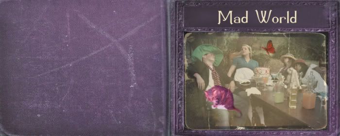
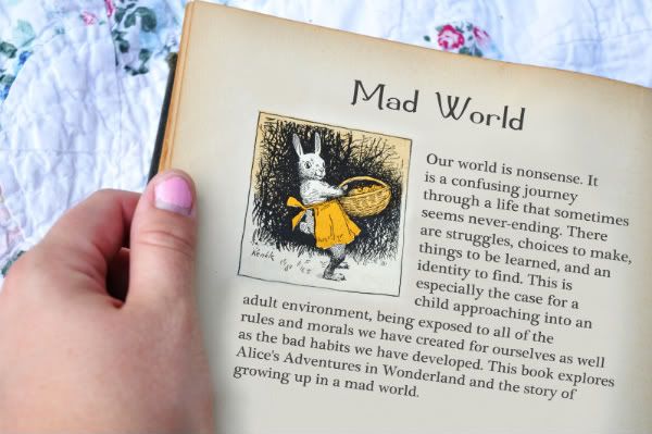
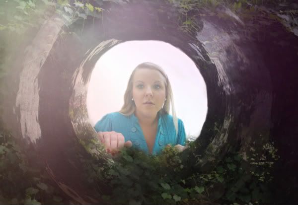
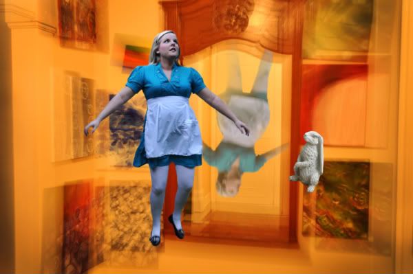
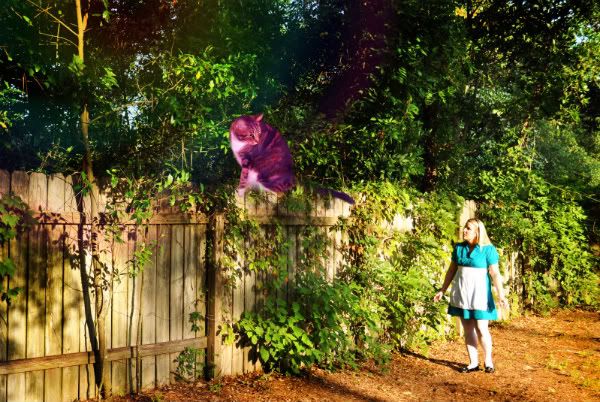
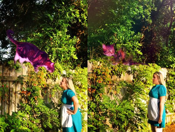
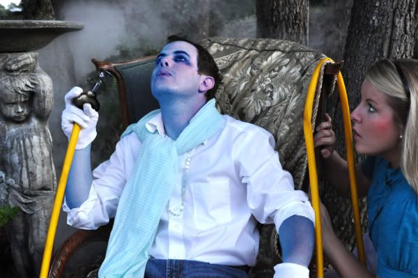
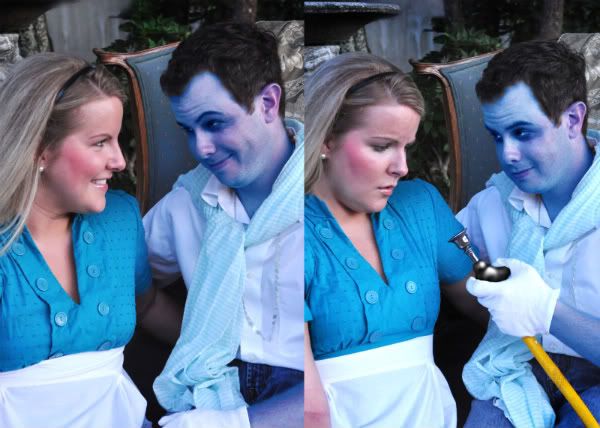
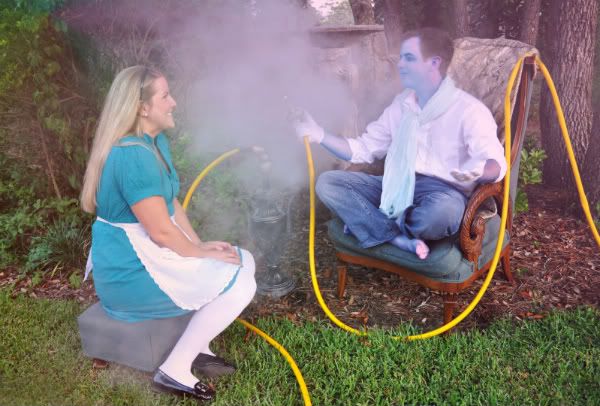
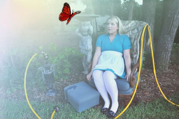
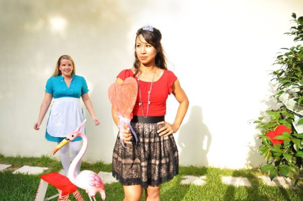
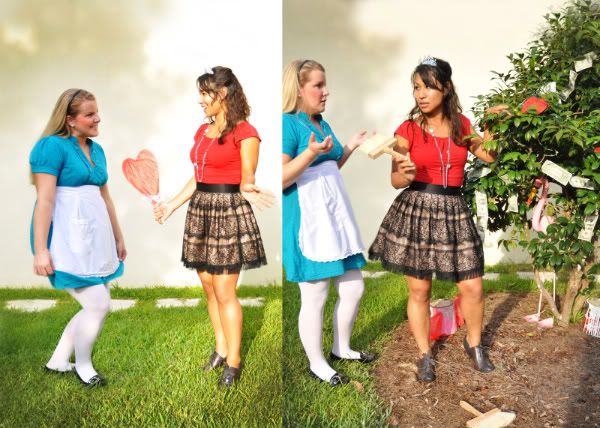
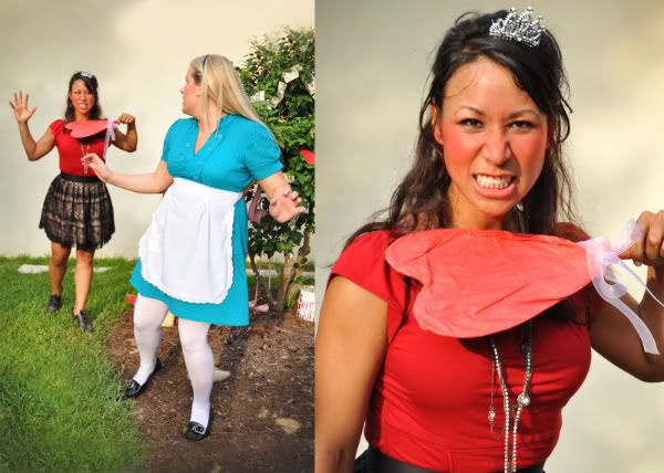
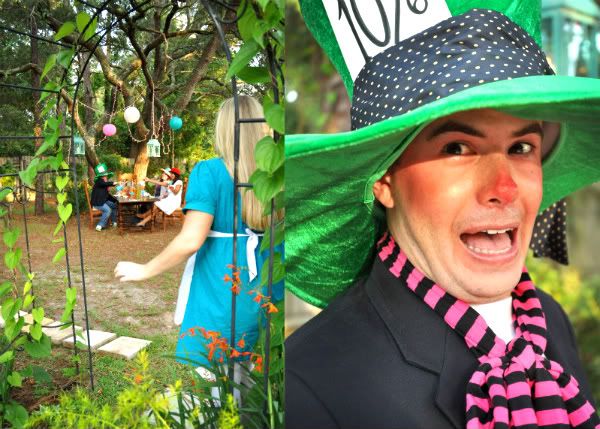
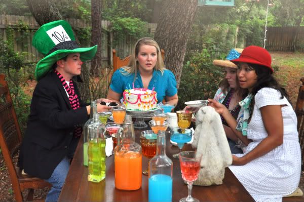
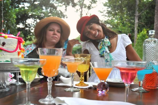
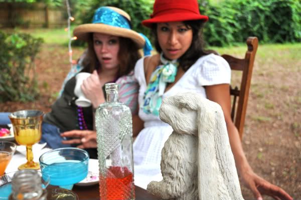
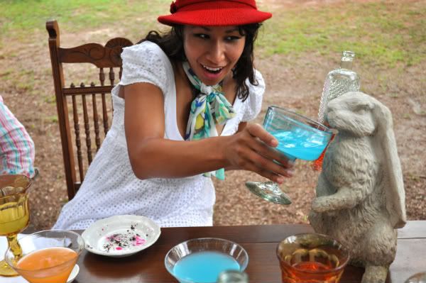
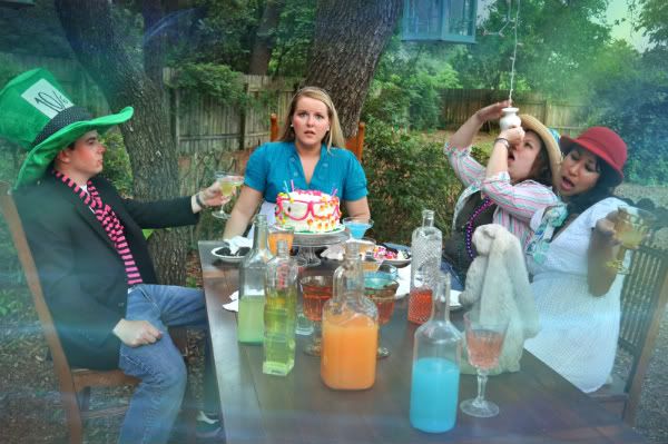
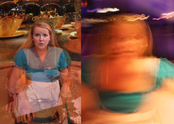
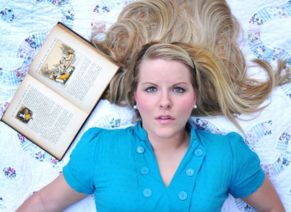
So I added a pic of my front cover & the inside of the first page of the book where the statement will go. I'm not sure if I like it yet... UGH I'm so undecisive! Anyways, I added a few more pics. I'm not crazy about the one with me in the teacup with the other teacups behind it. Should I not use it? For my book I want it to be 8x10, horizontal, with full bleed print. And that's about it for now! Please read last weeks post too! :D
Subscribe to:
Post Comments (Atom)
The picture with the tea cups behind you could probably be scrapped. It doesn't really seem like it belongs with the others. I like that the front of your book looks like an old story book. Keep up the good work!
ReplyDelete-Sarah Whitfield
I love the image with you in the tea cups I think it can work for some of your desent images like your other one below it. Are you gonna use an image of this cover for blurb or are you not using them?
ReplyDeleteI really like the old cover look you have for your front and back cover. I think the setup for the first spread in the book looks really nice too. Everything is looking good so I don't have much to say but keep up the great work. :)
ReplyDeleteits poppin. the layout ideas are great.
ReplyDeleteI LOVE it.. OMG! haha Maybe try using the blurry tea cup picture as the cover since it has hints of purple and it goes with the title. Keep it up! I can't wait to see the rest!!!
ReplyDeletethe ideas are great. i like the teacup pictures and i'd keep them.
ReplyDeleteThe teacups didn't bother me but maybe if you feel it's disjointed, use it on the artist's statement page?
ReplyDeleteI do like that the cover is a photo of a used cover. The color/layout/font is working and fun to look at.
i dont think the image of the teacups will need to be scrapped if you could somehow have some other photos that work with it. it pushes the idea of confusion that we run into in our everyday lives. you could maybe use the picture of the book and change the text to be your artist statement.
ReplyDeletei love your book cover. it is looks like story book. the statement hope make it more well. i love the color of your picture too. you are getting better. that' is good.
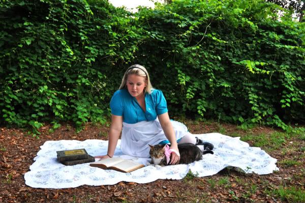
ReplyDeleteYour statement page is so cute. Your photos are great. I like the one with you in the teacups. It's really playing out like a story and it works well so far. You're doing a great job at portraying Alice. :)
ReplyDeleteI'm not too crazy about the cover of the book. I do really like the first page of the book though where your artist statement will go. I actually like the image of you with the other teacups in the background, don't think you need to get rid of it. Can't wait to see more pics from disney!
ReplyDeleteDanielle
I just love the front cover to your book, it works so well. Your new photos have definitely improved and it's great that you were able to go out on location to take some photos.
ReplyDelete--Nick Miller
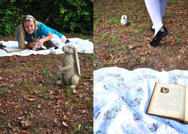
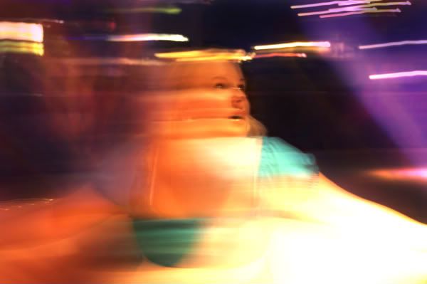
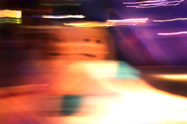
You are totally getting somewhere. Keep going and let yourself get freaky with those images without judgment. We will tell you if you have gone too far, but this recent jump into visual "madness" is working. Keep going and get weirder to test out the boundaries of your creativity. It is Alice in wonderland after all.
ReplyDeleteAddress your statement:
Our world is nonsense. A confusing journey through a life that sometimes seems never-ending
(this is a fragment!).
There are struggles, choices to make, things to be learned, and an identity to find. This is especially the case for a child approaching into an adult environment, being exposed to all of the rules and morals we have created for ourselves as well as the bad habits we have developed. (this book) explore(s) Alice's Adventures in Wonderland and the story of growing up in a mad world.
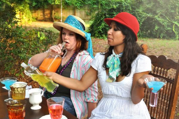
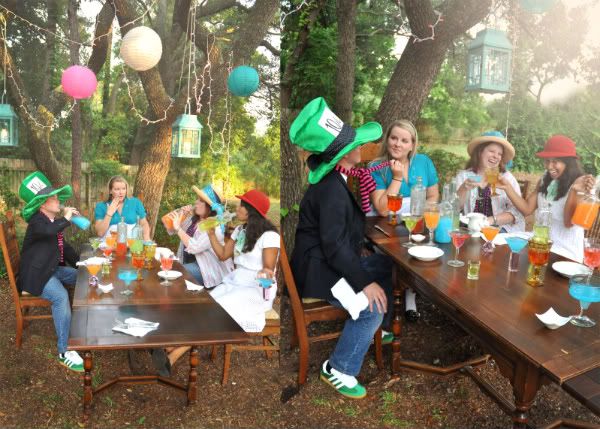
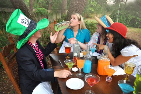
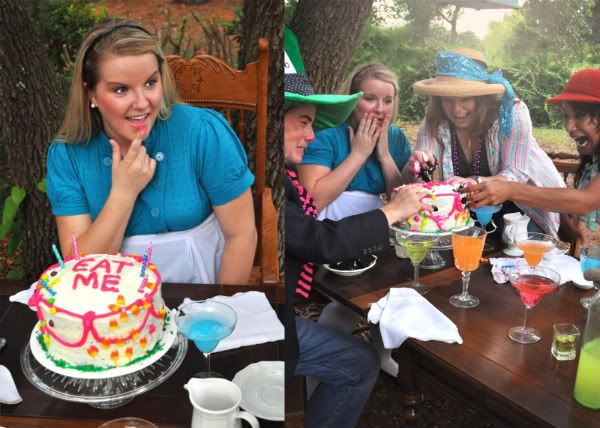
MOre pics!
xoxo
val
The title page works because we know Alice is an old story. The teacups gotta stay because we don't really know you are sitting in a giant teacup unless we have them in the background. Maybe have some more images of Alice in a dizzy world will make all the photos cohesive.
ReplyDeleteCan't wait to see more!
Elaine
wow, ur cover and whole book idea is looking so good! im glad u went with the older book look, i think it really helps emphasize ur artist statment. o, the new pics are so awesome, did u photoshop the one with the teacups? just wondering cuz its a great photo!cant wait to see more!
ReplyDelete