


Sunday, June 7, 2009
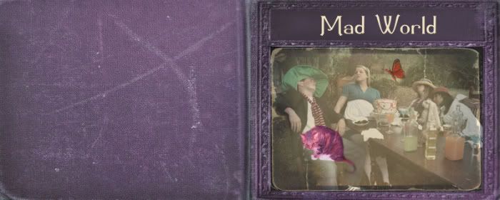
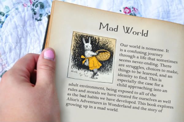
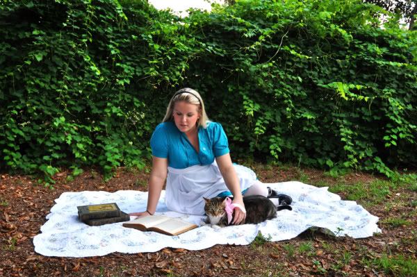
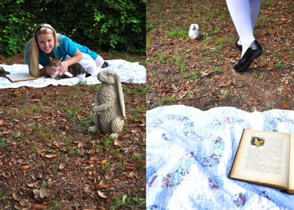
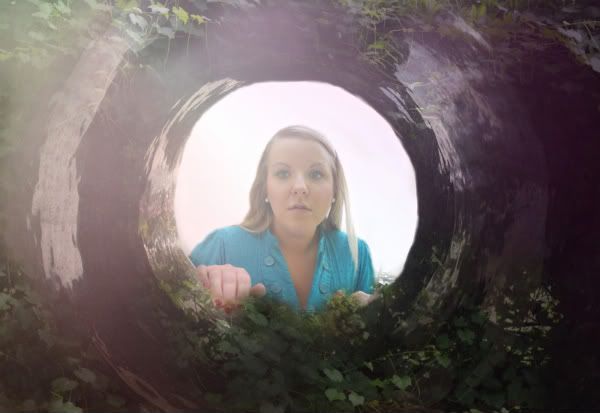
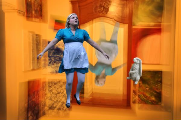
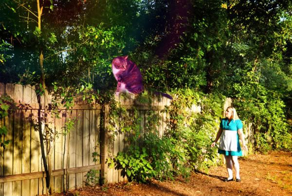
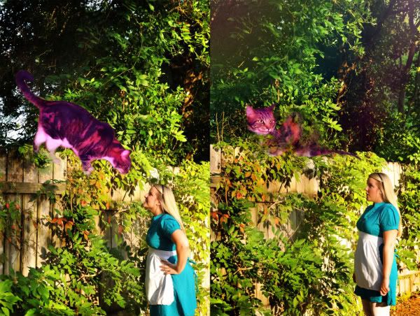
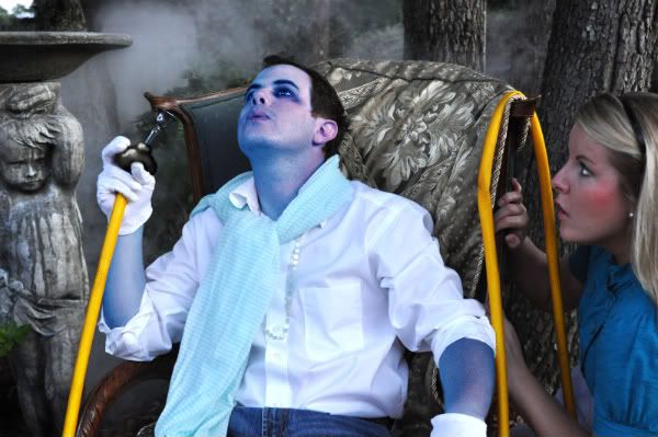
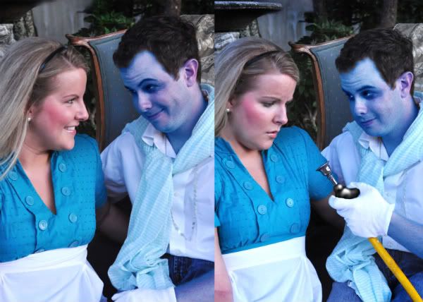
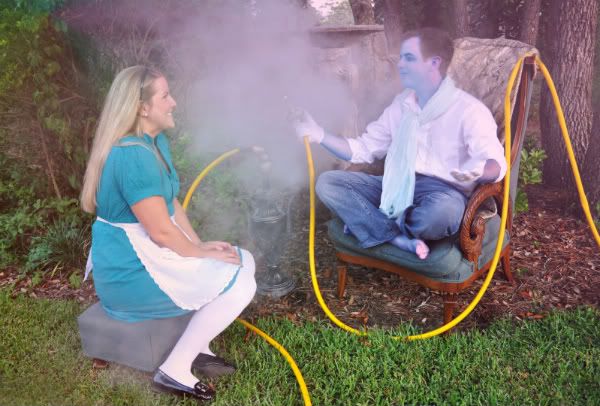
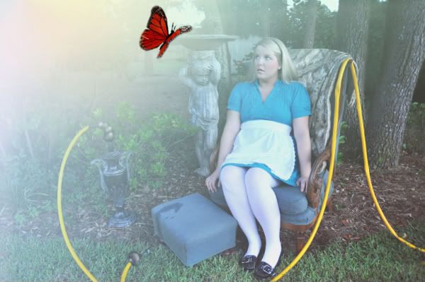
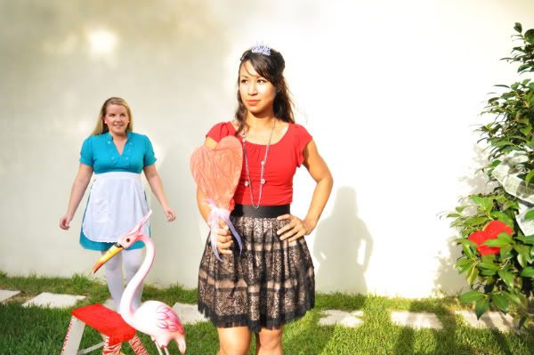
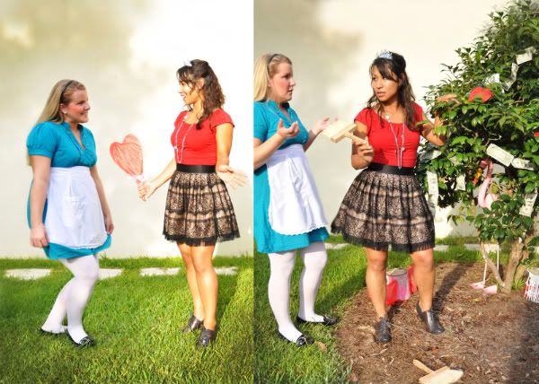
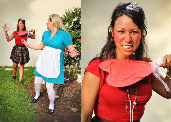
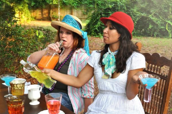
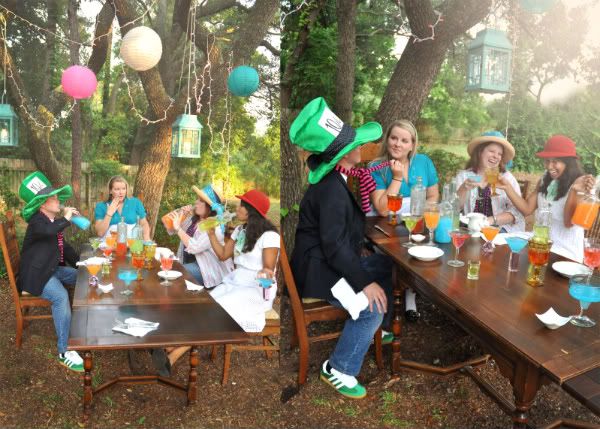
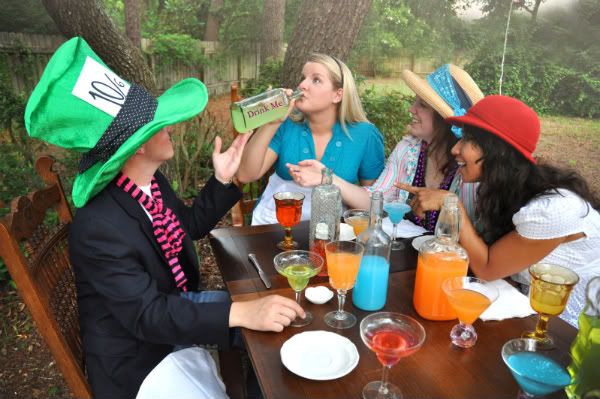
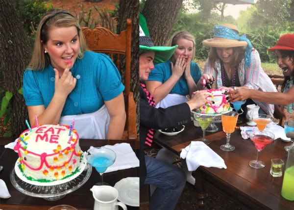
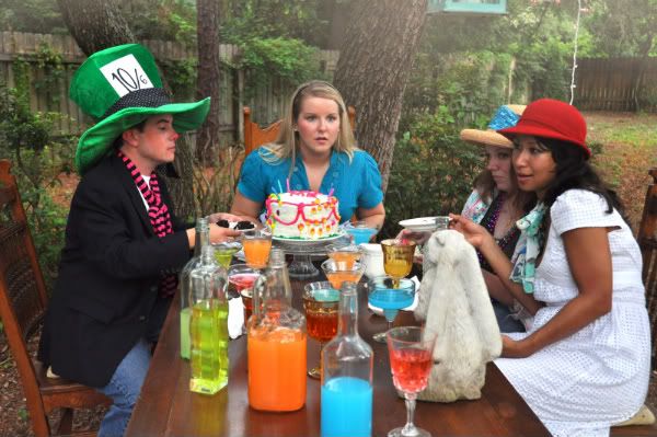
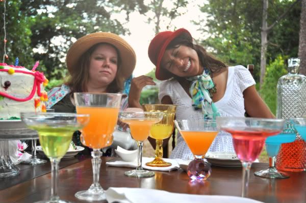
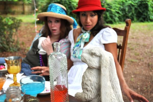
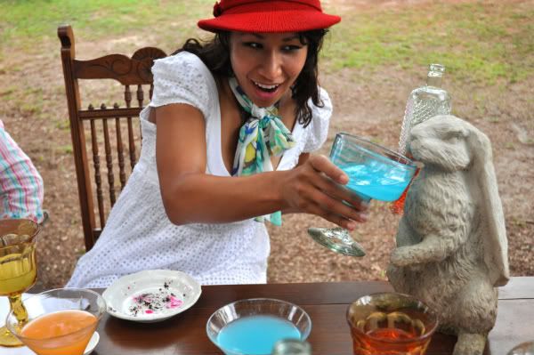
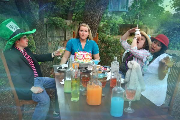
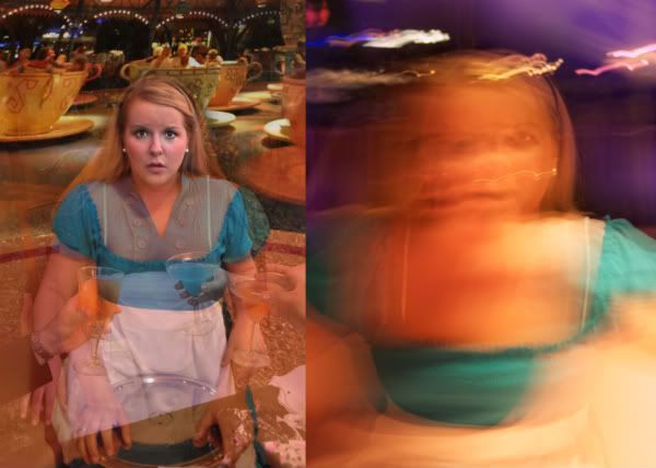
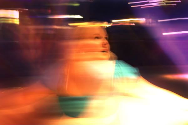
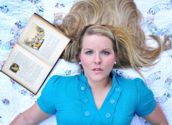
So I finally got started with my Alice shoot and thanks to a thrift shop I found THE perfect apron! YAY!! The five pictures up are going to be the first photos in the book... I might end up taking out one or two of them but I'm not sure which ones yet. Keep in mind that these first photos are pre-Wonderland and I want them to look more "pretty" and "innocent." I added a different font for my title (which I LOVE!)... and I'm still working on the statement. What do you guys think?
Subscribe to:
Post Comments (Atom)
Your first and last images are definitely the strongest. I like what I am seeing so far, but we need to be able to connect with the girl more. I think getting a little closer to Alice would be OK or making her pop a little more from her surroundings (even if it is just by stronger facial expressions). keep up the good work!! -Sky
ReplyDeleteThis comment has been removed by the author.
ReplyDeleteThese defiantly give off the cute vibe like you were planning. Try playing the crop tool on Photoshop to give some better angles to the pictures. Maybe even try the Rules of Third. Right now they aren't too exciting because Alice is placed right in the middle of the photo and it just looks more like a snap shot with a point-and-shoot. I'm really excited though because your Alice outfit turned out AMAZING! Good luck!
ReplyDeleteI agree with Sky on making the shots a little closer up. Especially with the second photo, where you're gazing off to the side. Also, with the third photo, you might try cropping yourself out a bit to make the rabbit more of a focal point. Great start! The last photo is definitely my fav!
ReplyDeleteYour concept and idea is really good. i love fist and third one. but the rest of it have no strong engagement. you might to need close-up photo. i mean the rest of picture was little bit loose vibe. the wide backgroud make me out of focus.
ReplyDeleteSeeing everything fleshed out really helps. I think these photos are a wonderful start. I agree with what everyone else is saying about working with cropping to make things stronger. :) I can't wait to see more!
ReplyDeleteThe colors are nice. The chipped polish in the first bothers me. The 2nd and 3rd are interesting but do need some cropping. Can you get a bigger bunny or zoom in? All in all I do totally respect your ambition and it's turning out.
ReplyDeleteThe colors are very vibrant in the photos as well as the clarity of the photos. Though, the photos could be framed up better. There is too much head room in two of the photos. Basically there too much empty space in the top half of several of the photos. Overall I find that you are doing a good job.
ReplyDelete--Nick Miller
I agree that some close up shots may be needed to engage the viewer a little more. The one with just the cat could probably be cut out altogether because we get the sense that you are leaving and following the rabbit in the last photograph. I can't wait to see more!
ReplyDelete-Sarah
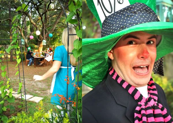
You look so cute! Glad to see that your idea is coming along strong in your photos. Are you going to incorporate the other characters?
ReplyDeleteGina
good job. you are pulling it off well so far. i like the first image of the book a whole lot. the vibrant colors match the emotion these put off. if you end up getting a bit "darker" with the photos, be sure to adjust the color differently.
ReplyDeleteThe last photo of the legs and bunny has a more interesting theme; what's going on and where is she going? I like the idea of a less staged photo, up close and personal.
ReplyDeleteElaine
You are getting great feedback, all of which I support!
ReplyDeleteLighting is good--but more closeups!
Shoot tons of images each time you stage a shoot.
Get closeups of all of your props--bunny, kitty, shoes, fabric, book, and you are on your way.
YAY!
Val
I agree with Sky. And the last image is the strongest to me. This is good. I'm excited about it and want to see more.
ReplyDeleteawesome... i can't wait for more.
ReplyDeleteIan
i think these photos make a great setup to show progression in the development of your character. the composition needs a little more work.
ReplyDeletealex
Your book idea is sure coming alive with these pictures! I also agree with sky that the pictures would be much more engaging if they were close up. The one of just your feet walking away is very nice and the colors in all of the pictures are very vibrant and beautiful! Great job so far!
ReplyDeleteDanielle